Published on ~ Updated on ~ Thoughts
Is my website's style to my taste?
A brief overview of the major versions of my personal website and the reasons behind my choices.
As you probably have imagined, I built this website myself. Actually, I’ve rebuilt it several times because I can’t decide how I want it. I think that this is due to the fact that as soon as I find new inspiration or a framework I like, I cannot stop thinking about it. If you like to tidy your home before hosting guests, well, I like to tidy MY home, my digital home, that is, in a certain way — the website you are reading. So, it has to be the thing that better represents me, what I did, and what my tastes are, even if this means rebuilding it twice a year. I want to spend some words about the major versions of it and why I chose them.
Hugo
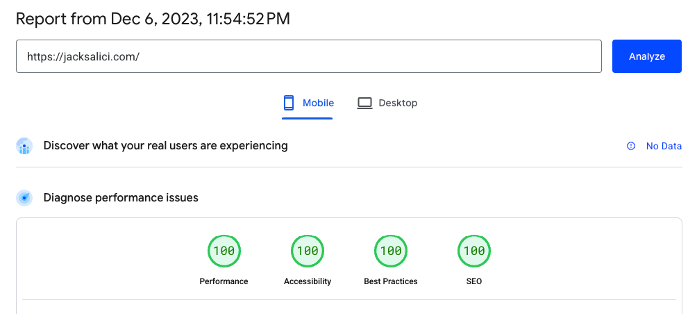
Until late 2023, the architecture was based on the Hugo framework. It was very minimal, and I liked that. Moreover, the theme has also been coded by me, using Tailwind and DaisyUI library, and the page scores are amazing. The template is called Salinger Theme and can be found here. On GitHub, it has several stars and forks, and it was one of the themes featured at the 2023 Hugo Convention.
Astro
In the last quarter of 2023, I found out Astro, and I fell in love with it, particularly for three features. Firstly, it’s UI agnostic, allowing me to use several UI frameworks at the same time. I haven’t used that feature yet (as for now, only the native Astro language), but in the future, I could mix some Vue components (where I am most confident) with some React (since it’s the most popular in the industry).
On the second instance, I like its completely component-oriented approach, solving the struggle of querying posts using Hugo templates. In Astro, it’s possible to integrate custom code everywhere, and it works like a charm since JSX-like code can be written on every HTML page. Since I also design the entire website by myself, it wasn’t really useful to have such a strong separation between content and templates as it was in Hugo (also considering the fact that my website is relatively very small).
Finally, it’s very fast. Faster than Hugo, actually (I got a +3% on PageSpeed Insight). That’s moved the needle.
Features
The entire source code of the website is open source and available on this GitHub repository.
Since the website is static, it’s really good both in performance and lightweightness, and moreover, it makes it possible to pay nothing for hosting (the whole thing is hosted on Netlify). The only expense I’m in charge of is the domain, which I have bought from Cloudflare for a few dollars per year.
I also added some easter eggs that no one will ever notice, so if you are curious, look for a 404 error for one instance of my broken humor…
The theme also uses some Google Symbols and Font Awesome icons, both imported directly as SVGs, and the fonts I use are all in local. Without any external script, I achieved the performances you have seen at the begin of the article. The fonts are offered by Fontsource, an open-source project that allows self-hosting fonts easily.
Since September 2024, I use Simple Analytics to see how many of you read my gibberish posts.
Simple Analytics is a privacy-friendly and simple alternative to Google Analytics. No cookies. No trackers. No consent required from your visitors. Just straightforward analytics. […] Built and hosted in the EU 🇪🇺, we believe in an internet that is friendly to website visitors.
